Lisa Ly,
Senior Product Designer
Home
Spark
Electricity asset and market monitoring system for Origin Energy Wholesale.
Client
Origin Energy
Services
Systems
Research
Industries
Energy Markets
Role
Lead Product Designer
Team Makeup
1 x Delivery Manager, 1 x Analyst, 1 x Developer, 1 x Designer
Date
April 2024 - Ongoing

Project has been renamed and images reproduced for privacy reasons.
Context & Problem
Origin Energy is expanding its renewable energy portfolio and identified the need for a new way to monitor the market. It must be trader-centric in design and optimised to view batteries in the portfolio.
As the first design hire in Wholesale, I led the design strategy and leveraged AI to accelerate design thinking.
Users & Environment
Key users consist of spot traders and strategy traders. With trading and compliance management as secondary users.
Traders currently navigate fast-paced, high-stakes markets characterised by unpredictability and swift settlements.
Workflows rely on real-time and accurate data monitoring to inform compliant and efficient bidding.
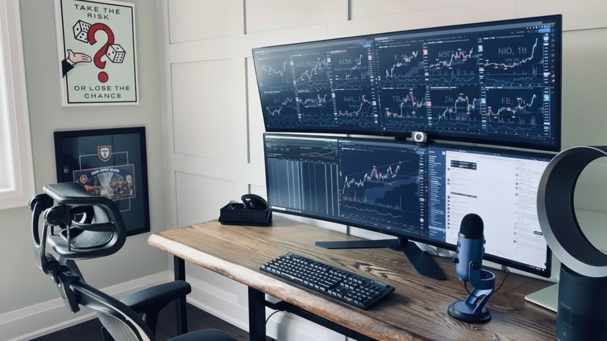
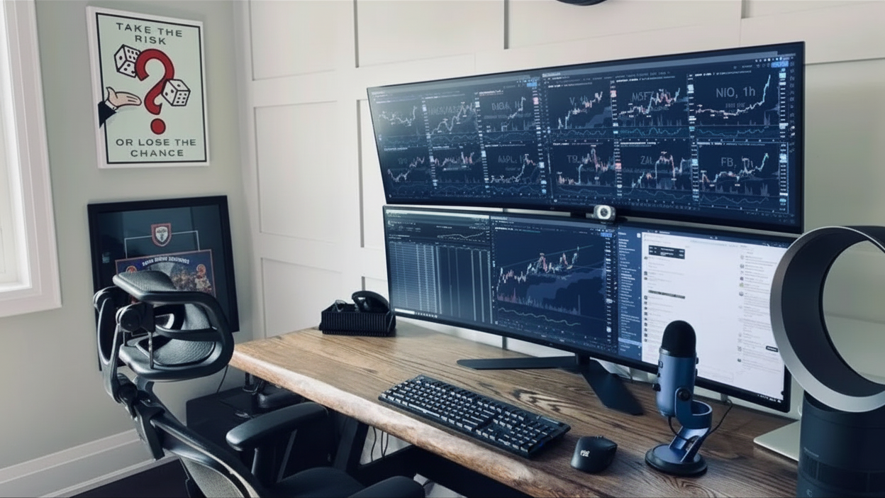
Example of trading desk. Source: Google
Final design
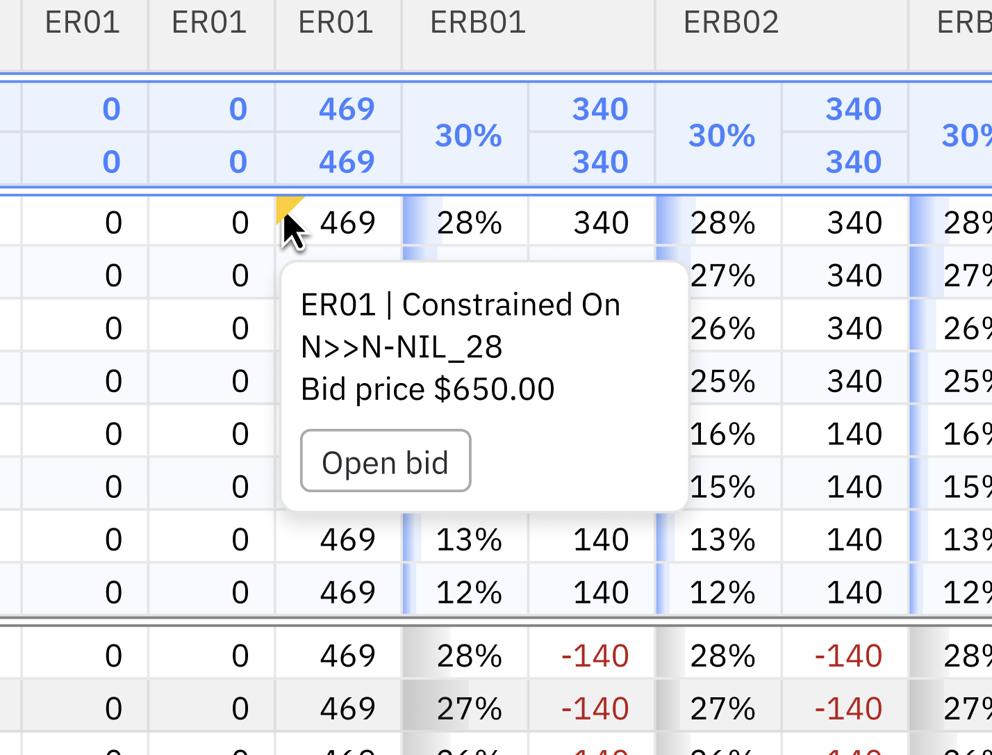
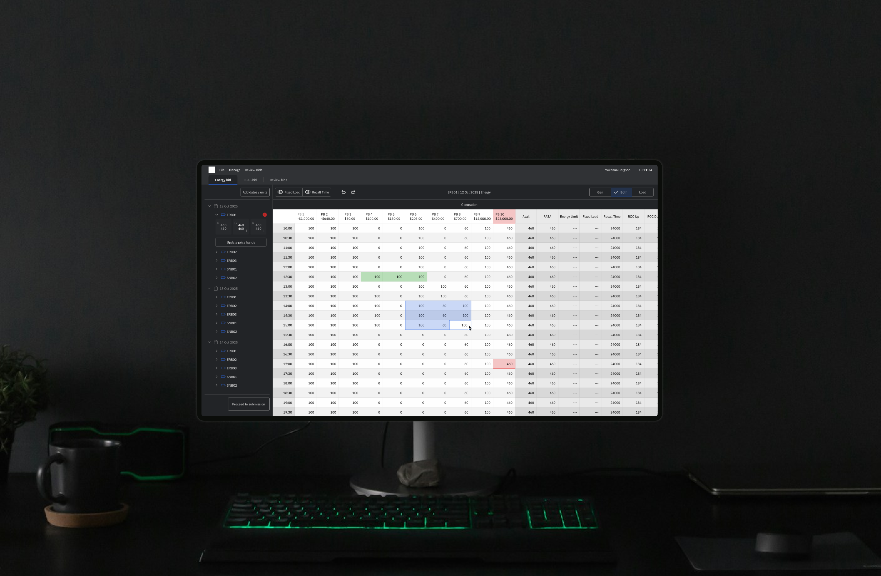
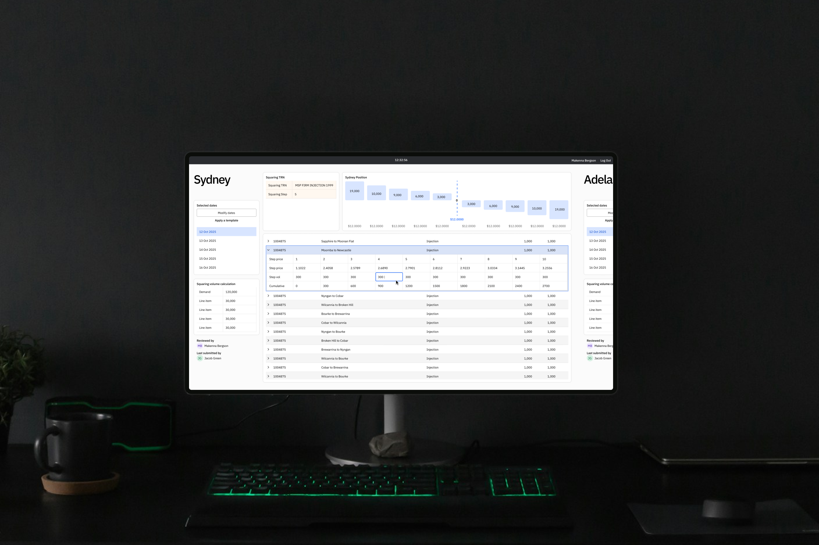
Information hierarchy is essential for clarity, serving a functional purpose rather than just decoration. Despite only a 30% increase in size, the volume of on-screen data has more than doubled while remaining visually distinct and legible.
Key features
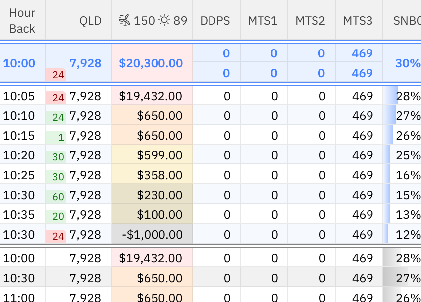
Next 5 minute settlement dataA single row that displays nearly 100 points of data, understood immediately by the trading team. Legible from home and office set ups.
Streamlined workflows for biddingPurposefully place and considered quick links to trading bidding platform cuts out multiple steps to reacting to market events.

Trends at a glanceDispatch and pre-dispatch data interpreted into trends that are understandable within seconds.
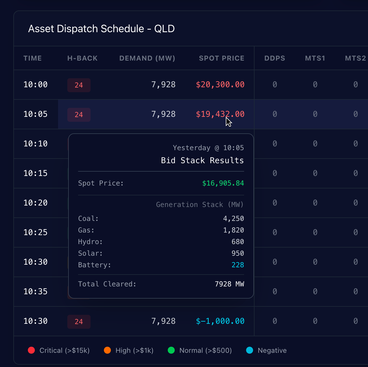
Drill into detailsInsights and analytics at the click of a button, whilst preserving real estate for more pertinent data.
Goals & Success
Workshops conducted with Traders and Wholesale department suggested success would mean the following:
Wholesale technology goals

Reduce tech maintenance by consolidating market and asset monitoring
Reduce operational and financial risk
Build a maintainable, scalable solution
Trading goals
Access the most up-to-date and relevant data to inform bidding
Identify port folio opportunities and responde proactively
Low-touch interface with ability to drill in as needed
Research & Insights
I was hands on with the trading team, delving deep via:
Interviews with stakeholders across all levels
Immersion in trading activities to understand real-time decision-making under pressure
Continuous feedback loops and iteration cycles
Patterns, behaviours, pain points:
The trading floor is hectic; filled with visuals, sound, and lots of numbers
12-hour night and day shifts causes fatigue and highlights the need for clear interfaces
Interaction designs must enable quick decisions while minimising errors
Key insights from live trading immersion:
To each trader is a unique bidding style... some more risky than others
Traders use magnification tools to help with focus
Display of data becomes a minefield of balancing trader preferences
Strategy & Vision
Design principles for Ibis
1
Interface is designed with intention
2
Minimise cognitive load without losing necessary detail
3
Support expert users while remaining usable under fatigue
These principles anchored the product in clarity, speed, and trust—essential in high-risk, compliance-heavy trading environments.
My plan...
There’s likely over 100 data sources being funnelled into a single screen. Designing with intention and systems thinking is critical in conveying a story that traders can quickly understand.
Things to consider
- Discrete numbers vs graphs: both required, but high level visualisations take less screen space
- Design for scale
- Accessibility cannot be forgotten
- Design for compliance
Exploration
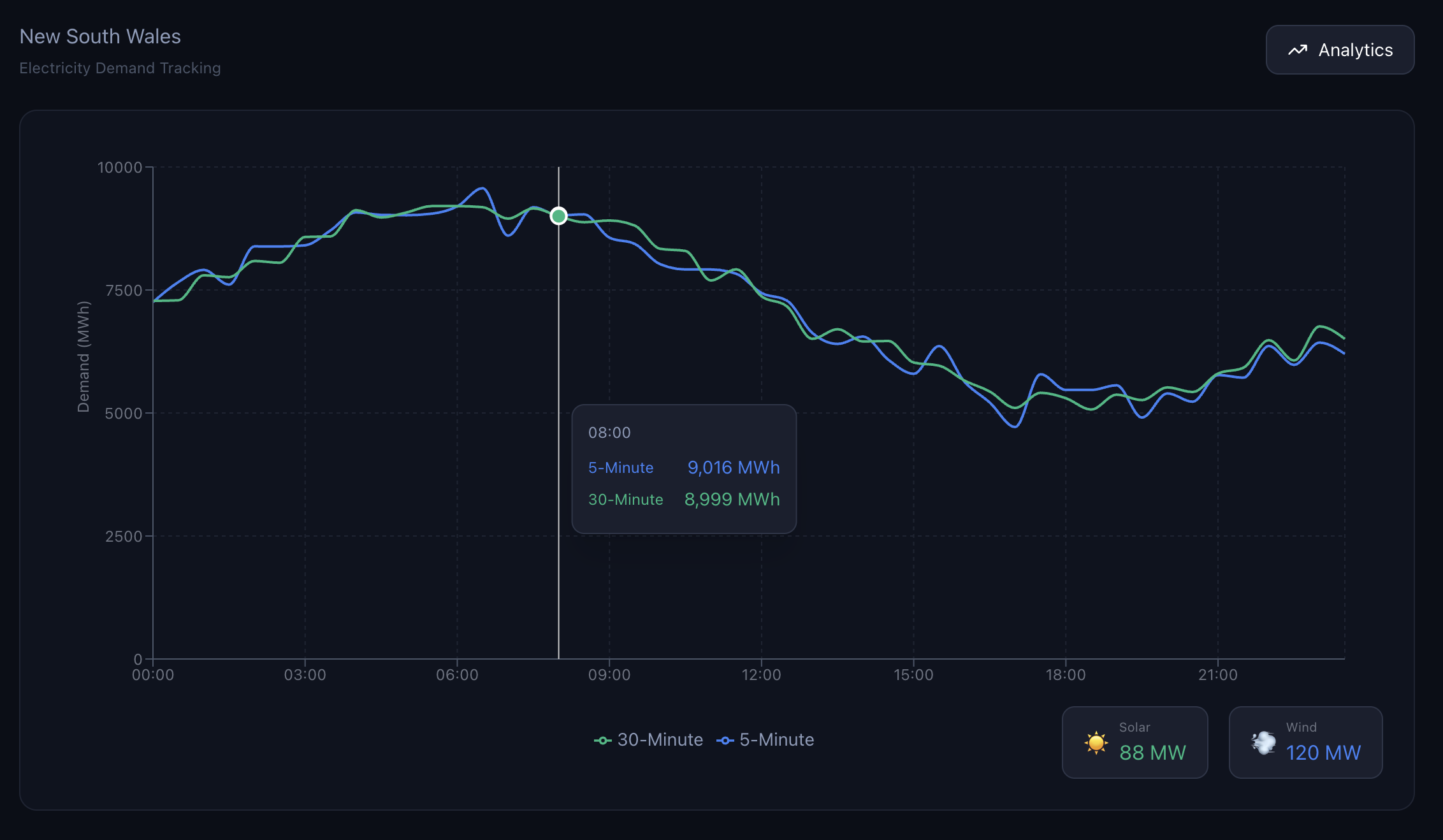
Demand graph iteration: concepting with Figma Make to generate robust mock-ups.

Battery data from 3 columns to 2 to reclaim real estate.

Crafting narratives through micro-interfaces while ensuring clarity.
Cells, cells, and more cells
Display of data in cell format continues to evolve. Each cell tells multiple stories which is what makes the grid so finicky. I am experimenting with detailed UI work with the considerations mentioned above.
Trade-offsFrom the development and technical perspective, I predict there will be the issue of missing CSS. Due to the custom nature of this project, the native CSS is being overridden. As time for development approaches, I’ll be having to carefully prioritise which elements make it into build.
See other featured projects 2

Lisa Ly,
Senior Product Designer
This portfolio is mobile-friendly and handcrafted in Figma sites.
Lisa Ly,
Senior Product Designer
Home
Spark
Electricity asset and market monitoring system for Origin Energy Wholesale.
Client
Origin Energy
Services
Systems
Research
Industries
Energy Markets
Role
Lead Product Designer
Team Makeup
1 x Delivery Manager, 1 x Analyst, 1 x Developer, 1 x Designer
Date
April 2024 - Ongoing
Project has been renamed and images reproduced for privacy reasons.
Context & Problem
Origin Energy is expanding its renewable energy portfolio and identified the need for a new way to monitor the market. It must be trader-centric in design and optimised to view batteries in the portfolio.
As the first design hire in Wholesale, I led the design strategy and leveraged AI to accelerate design thinking.
Users & Environment
Key users consist of spot traders and strategy traders. With trading and compliance management as secondary users.
Traders currently navigate fast-paced, high-stakes markets characterised by unpredictability and swift settlements.
Workflows rely on real-time and accurate data monitoring to inform compliant and efficient bidding.
Example of trading desk. Source: Google
Final design
Information hierarchy is essential for clarity, serving a functional purpose rather than just decoration. Despite only a 30% increase in size, the volume of on-screen data has more than doubled while remaining visually distinct and legible.
Key features
Next 5 minute settlement dataA single row that displays nearly 100 points of data, understood immediately by the trading team. Legible from home and office set ups.
Streamlined workflows for biddingPurposefully place and considered quick links to trading bidding platform cuts out multiple steps to reacting to market events.
Trends at a glanceDispatch and pre-dispatch data interpreted into trends that are understandable within seconds.
Drill into detailsInsights and analytics at the click of a button, whilst preserving real estate for more pertinent data.
Goals & Success
Workshops conducted with Traders and Wholesale department suggested success would mean the following:
Wholesale technology goals
Reduce tech maintenance by consolidating market and asset monitoring
Reduce operational and financial risk
Build a maintainable, scalable solution
Trading goals
Access the most up-to-date and relevant data to inform bidding
Identify port folio opportunities and responds proactively
Low-touch interface with ability to drill in as needed
Research & Insights
I was hands on with the trading team, delving deep via:
Interviews with stakeholders across all levels
Immersion in trading activities to understand real-time decision-making under pressure
Continuous feedback loops and iteration cycles
Patterns, behaviours, pain points:
The trading floor is hectic; filled with visuals, sound, and lots of numbers
12-hour night and day shifts causes fatigue and highlights the need for clear interfaces
Interaction designs must enable quick decisions while minimising errors
Key insights from live trading immersion:
To each trader is a unique bidding style... some more risky than others
Traders use magnification tools to help with focus
Display of data becomes a minefield of balancing trader preferences
Strategy & Vision
Design principles for Ibis
These principles anchored the product in clarity, speed, and trust—essential in high-risk, compliance-heavy trading environments.
My plan...
There’s likely over 100 data sources being funnelled into a single screen. Designing with intention and systems thinking is critical in conveying a story that traders can quickly understand.
Things to consider
- Discrete numbers vs graphs: both required, but high level visualisations take less screen space
- Design for scale
- Accessibility cannot be forgotten
- Design for compliance
1
Interface is designed with intention
2
Minimise cognitive load without losing necessary detail
3
Support expert users while remaining usable under fatigue
Exploration
Demand graph iteration: concepting with Figma Make to generate robust mock-ups.
Battery data from 3 columns to 2 to reclaim real estate.
Crafting narratives through micro-interfaces while ensuring clarity.
Cells, cells, and more cells
Display of data in cell format continues to evolve. Each cell tells multiple stories which is what makes the grid so finicky. I am experimenting with detailed UI work with the considerations mentioned above.
Trade-offsFrom the development and technical perspective, I predict there will be the issue of missing CSS. Due to the custom nature of this project, the native CSS is being overridden. As time for development approaches, I’ll be having to carefully prioritise which elements make it into build.
See other featured projects 2

Lisa Ly,
Senior Product Designer
This portfolio is mobile-friendly and handcrafted in Figma sites.
Lisa Ly,
Senior Product Designer
Home
Ibis
Electricity asset, renewables and market monitoring system.
Client
Origin Energy
Services
Systems
Research
Industries
Energy Markets
Role
Lead Product Designer
Team Makeup
1 x Delivery Manager, 1 x Analyst, 1 x Developer, 1 x Designer
Date
June 2025 - Ongoing
Project has been renamed and images reproduced for privacy reasons.
Context & Problem
Origin Energy is expanding its renewable energy portfolio and identified the need for a new way to monitor the market. It must be trader-centric in design and optimised to view batteries in the portfolio.
As the first design hire in Wholesale, I led the design strategy and leveraged AI to accelerate design thinking.
Users & Environment
Key users consist of spot traders and strategy traders. With trading and compliance management as secondary users.
Traders currently navigate fast-paced, high-stakes markets characterised by unpredictability and swift settlements.
Workflows rely on real-time and accurate data monitoring to inform compliant and efficient bidding.
Example of trading desk. Source: Google
Final design
Information hierarchy is essential for clarity, serving a functional purpose rather than just decoration. Despite only a 30% increase in size, the volume of on-screen data has more than doubled while remaining visually distinct and legible.
Key features
Next 5 minute settlement dataA single row that displays nearly 100 points of data, understood immediately by the trading team. Legible from home and office set ups.
Streamlined workflows for biddingPurposefully place and considered quick links to trading bidding platform cuts out multiple steps to reacting to market events.
Trends at a glanceDispatch and pre-dispatch data interpreted into trends that are understandable within seconds.
Drill into detailsInsights and analytics at the click of a button, whilst preserving real estate for more pertinent data.
Goals & Success
Workshops conducted with Traders and Wholesale department suggested success would mean the following:
Wholesale technology goals
Reduce tech maintenance by consolidating market and asset monitoring
Reduce operational and financial risk
Build a maintainable, scalable solution
Trading goals
Access the most up-to-date and relevant data to inform bidding
Identify port folio opportunities and respond proactively
Low-touch interface with ability to drill in as needed
Research & Insights
I was hands on with the trading team, delving deep via:
Interviews with stakeholders across all levels
Immersion in trading activities to understand real-time decision-making under pressure
Continuous feedback loops and iteration cycles
Patterns, behaviours, pain points:
The trading floor is hectic; filled with visuals, sound, and lots of numbers
12-hour night and day shifts causes fatigue and highlights the need for clear interfaces
Interaction designs must enable quick decisions while minimising errors
Key insights from live trading immersion:
To each trader is a unique bidding style... some more risky than others
Traders use magnification tools to help with focus
Display of data becomes a minefield of balancing trader preferences
Strategy & Vision
Design principles for Ibis
These principles anchored the product in clarity, speed, and trust—essential in high-risk, compliance-heavy trading environments.
My plan...
There’s likely over 100 data sources being funnelled into a single screen. Designing with intention and systems thinking is critical in conveying a story that traders can quickly understand.
Things to consider
- Discrete numbers vs graphs: both required, but high level visualisations take less screen space
- Design for scale
- Accessibility cannot be forgotten
- Design for compliance
1
Interface is designed with intention
2
Minimise cognitive load without losing necessary detail
3
Support expert users while remaining usable under fatigue
Exploration
Demand graph iteration: concepting with Figma Make to generate robust mock-ups.
Battery data from 3 columns to 2 to reclaim real estate.
Crafting narratives through micro-interfaces while ensuring clarity.
Cells, cells, and more cells
Display of data in cell format continues to evolve. Each cell tells multiple stories which is what makes the grid so finicky. I am experimenting with detailed UI work with the considerations mentioned above.
Trade-offsFrom the development and technical perspective, I predict there will be the issue of missing CSS. Due to the custom nature of this project, the native CSS is being overridden. As time for development approaches, I’ll be having to carefully prioritise which elements make it into build.
Other featured projects 2

Lisa Ly,
Senior Product Designer
This portfolio is mobile-friendly and handcrafted in Figma sites.